We built SterlingNOW to help Sterling expand its reach for background checks into the SMB space. Our team’s research showed customers were discouraged from signing up because the form looked unprofessional. I drove attention to detail in the UI implementation, and the redesigned signup flow doubled our conversion rate.
A long, dense signup form discouraged signup
Our team shipped an MVP with a signup form for small business owners to order background checks for new hires, but conversion rates were low.
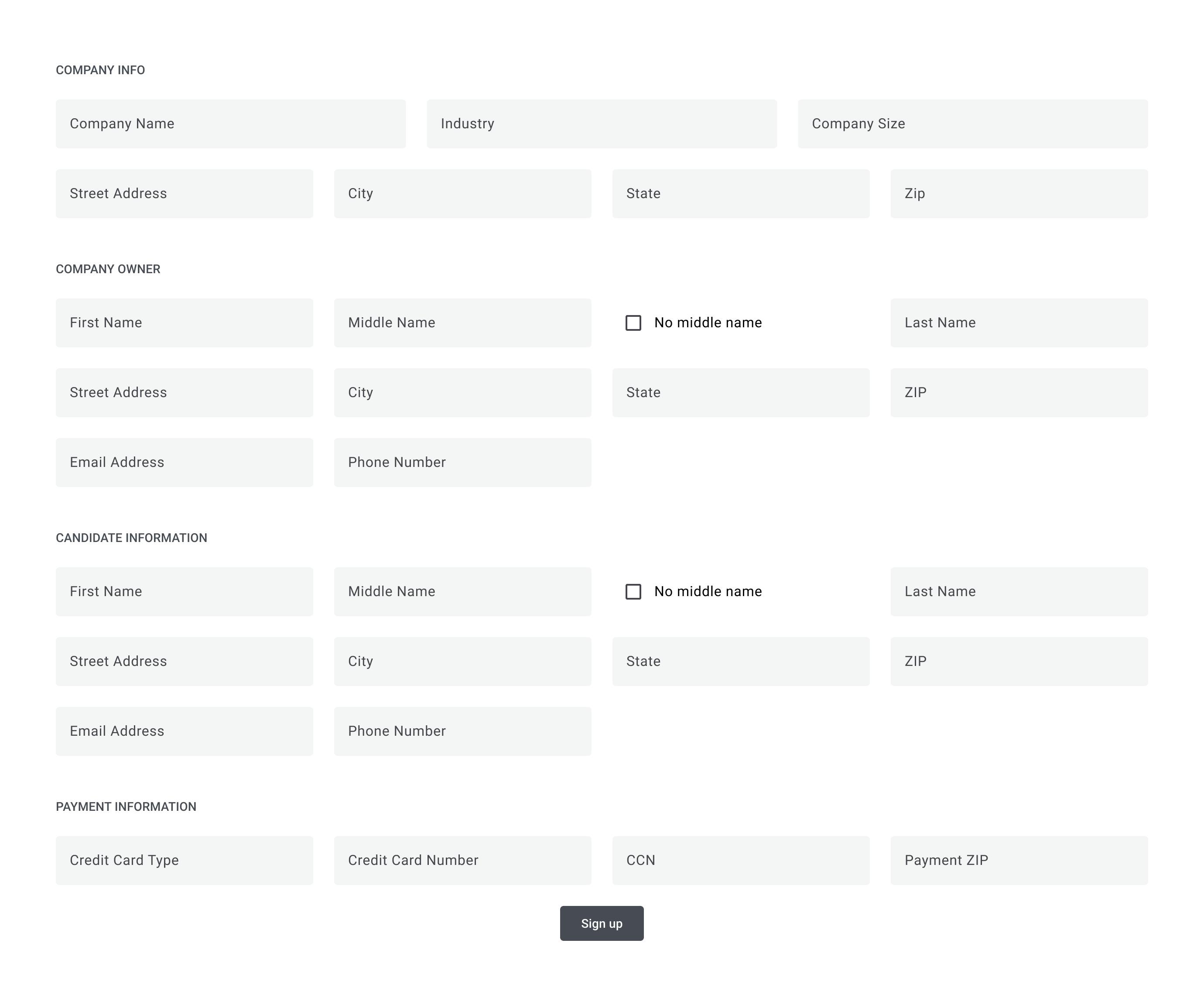
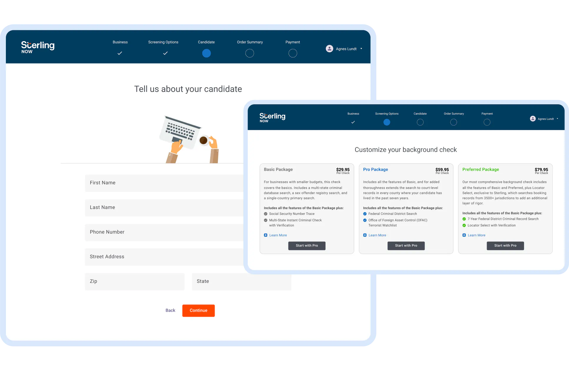
The MVP signup form. User research showed this form turned away potential customers because it was too long, intimidating, and looked unprofessional—their words, not ours!
Our customer research found two pain points to address:
- SMB owners are more likely to utilize simpler looking interfaces—compared to the enterprise HR professionals Sterling’s core product cater to, who use more complicated workflows in their software every day.
- Potential customers shared that our signup form looked unprofessional, which discouraged them from trusting SterlingNOW with their business.
Getting support to deliver agency-level polish in an enterprise B2B company
Our research showed that potential customers expect our platform to look professional. To deliver on this, I made a business case for implementing the design in a level of detail unprecedented within the company.
The business model for SterlingNOW was different from typical enterprise B2B software, where some teams believe that if the person using the software is not also paying for it, then executing well on design isn’t a valuable investment.
I pointed out that for this project, the person using the app is also the person paying us. If we don’t deliver the amount of polish it takes for them to trust us, we won’t win their business.
This includes little details that make a big difference, like using column grids, font ramps, and spacing ramps to establish a visual rhythm.
An engineering manager had a little concern that I might be “boiling the ocean” with so much detail. I replied that these are all details I learned how to work with quickly in a recent agency role, and that some quick project setup won’t cause us to lose velocity.
I was able to get buy-in to build a style guide quickly, so our software engineers can build the design right the first time. This would allow us to avoid a time-consuming clean-up pass on dozens of pages at the end of the project.
Translating a mid fidelity prototype to high fidelity React components
The team chose to make our form easier for SMB owners to understand by splitting it up into smaller pieces, and adding some friendly imagery.
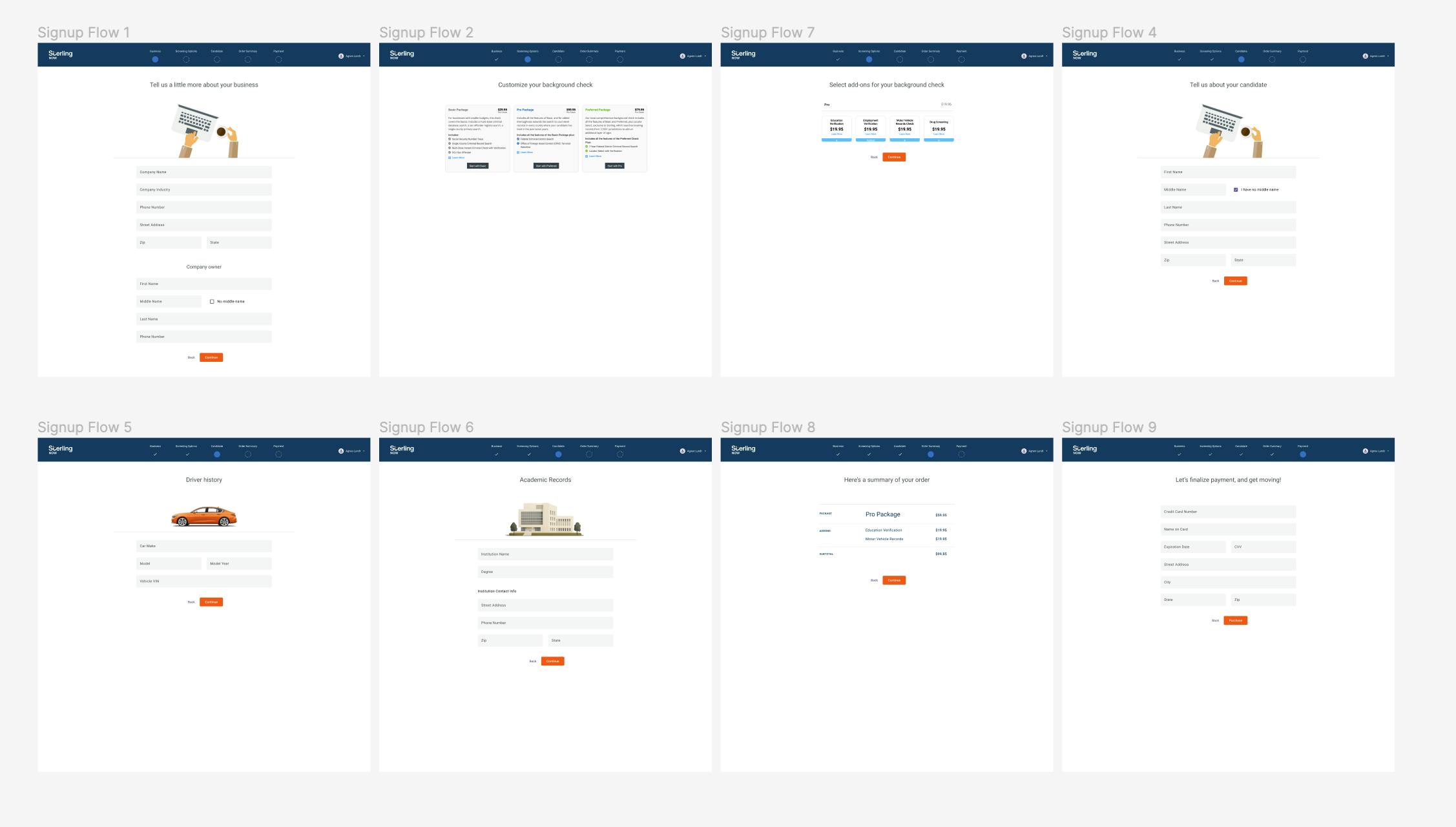
This 10,000 foot perspective helped me prioritize: Seeing several of the screens, zoomed out, made it clear that most screens were forms, so I built a style guide for form pages first. Once that was done, I worked on the more unique screens in the flow with the designer, as engineers used the React components I wrote in TypeScript to wire up dozens of form screens.
Our prototype focused on form structure, and general look and feel, but details like grids, font sizes, and accessible colors weren’t prioritized. I saw this as an opportunity.
I met with our designer, to propose improvements to these details directly in code, until we both felt the React components in the style guide delivered the high fidelity version of the desired design style.
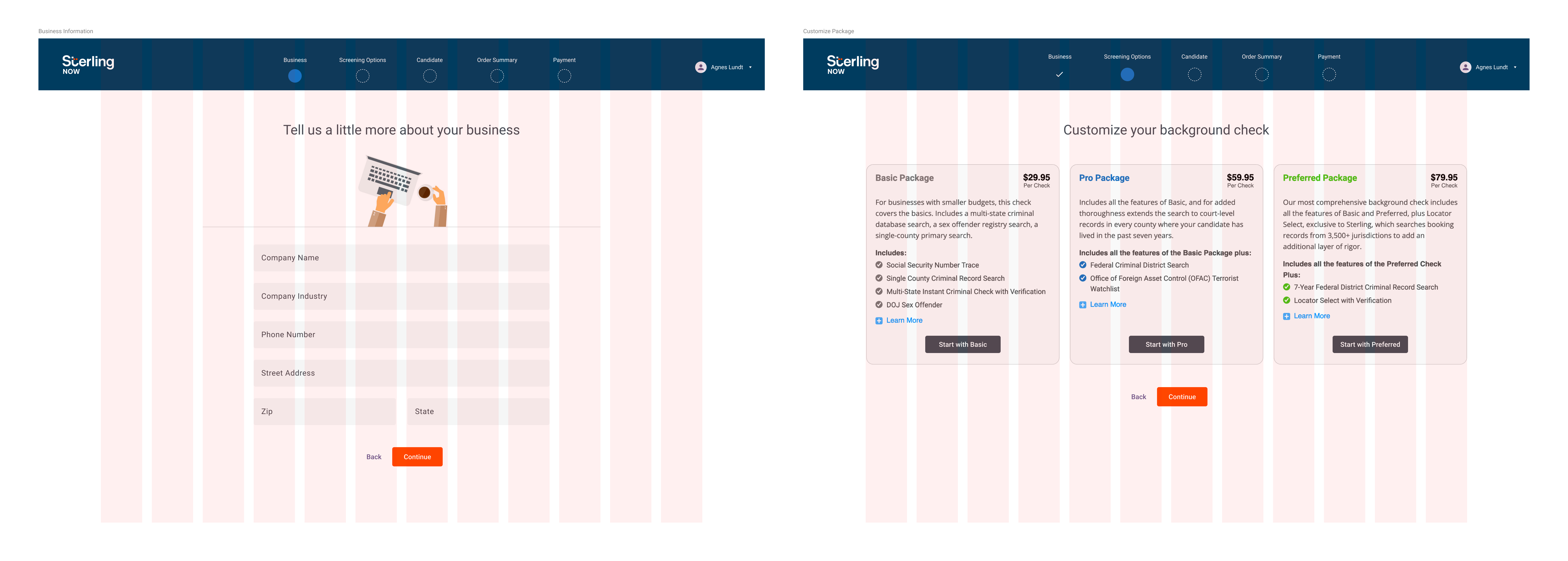
Consistent visual rhythm matters more than consistent use of space. For our forms to appear approachable and simple, they needed to take up only a limited amount of space. However, we also had some screens that needed more space. I proposed a way to get both layouts to work on the same grid, establishing visual harmony between different layouts.
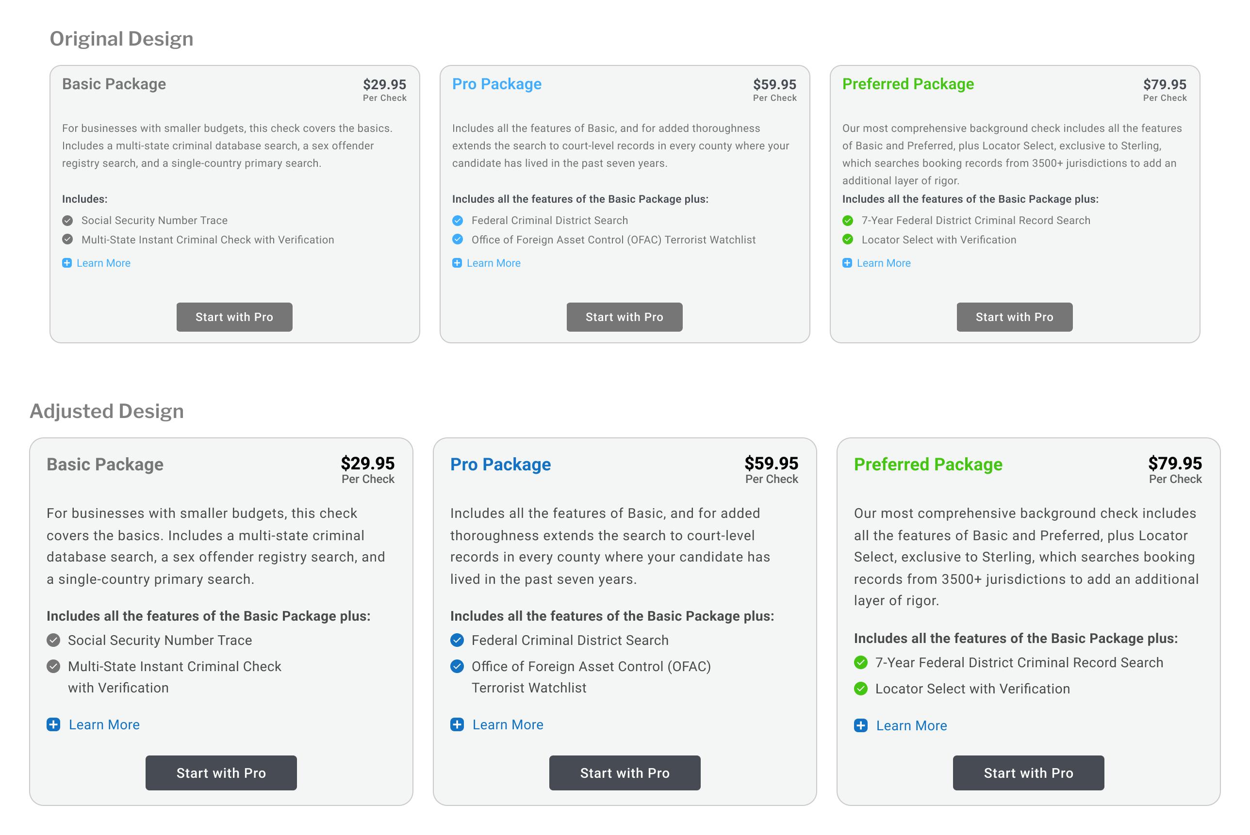
Improved accessibility. Working with the designer, I proposed changes to ensure contrast passes the WCAG AA level, and we increased the main text size shown here from 11px to a more readable 14px. Although this size is small for body copy, this part of the design doesn’t have a full page’s worth of text, so we concluded this size balances compactness and readability.
Using the company’s design system where it made sense
I used Sterling’s core design system for UI primitives, like input fields and buttons—but I didn’t strictly adhere to the design system.
Sterling’s target users are enterprise HR professionals, who are pretty different from a small business (SMB) owner. We diverged from the design system for things like how we set up our column grid, and the spacing between form elements, because our customer research showed that dense forms lowered the conversion rates we have with SMB customers.
Launching the redesign doubled our conversion rate
Knowing that potential customers were turned away by a design that didn’t look professional, getting a 2x conversion rate showed that getting visual details right makes a real difference in driving value.
My decision to start with a style guide for form pages paid off. Engineers had plenty of work with form validation, managing form values in global state, saving progress in the middle of the workflow, and more. This gave me space to work on the special case pages, without blocking engineers.
Setting up the right meetings with the right people
When the details in the prototypes weren’t quite right, I scheduled some jam sessions with just the designer—but opted not to invite stakeholders until we felt confident about presenting the work.
The designer and I had jam sessions together, and then presented the output from those meetings.
In conversations with our stakeholders, I learned they weren’t interested in micromanaging those details. They were pleased the designer and I could improve the visuals—especially because our research showed this was a hard requirement—without requiring them to attend yet another meeting.