Our web app published road closures data we already had as a map, and reduced the manual labor of data entry so significantly, one user reported it changed their Friday schedule from completely busy, to completely free.
Additionally, I was able to design and implement a responsive redesign of the app, saving 77% from the engineer’s estimate.
Drivers could only learn about road closures from subscribing to the newspaper, or a mailing list
Even though the City is the official data source on which roads will close, this data was mostly used for internal processes.
The City published a weekly mailing list of road closures. However, the Mayor felt political pressure to get the City’s data on road closures into the hands of the public in a format they can understand.
Illuminating the process with user shadowing
Emails about road closures accumulated throughout the week. Starting on Friday morning, our maintainer opened every single one, copying and pasting the information into a new email window.

What we observed: Copying and pasting text was fast, but manually formatting it was slow.
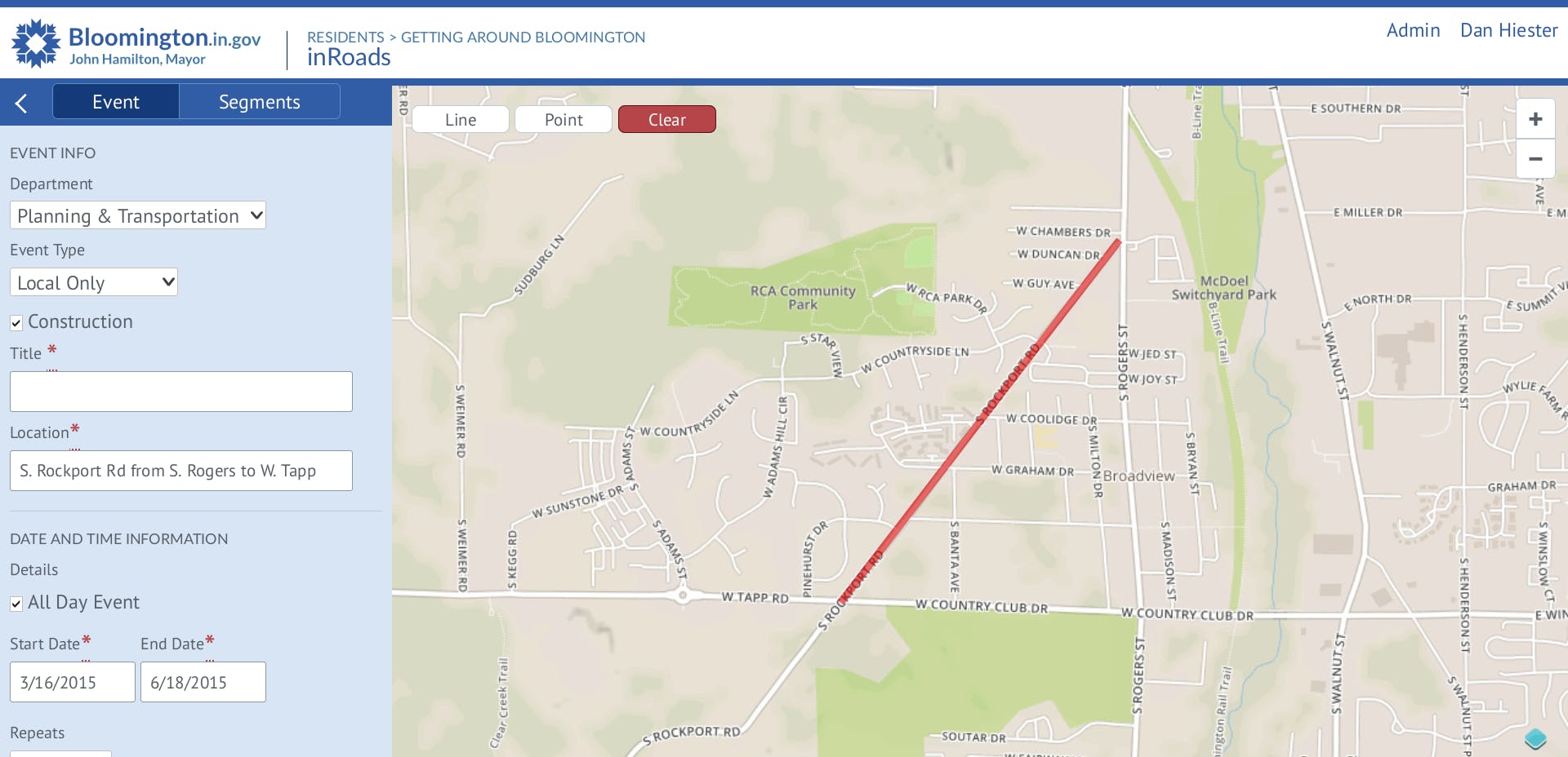
Replacing the mailing list with a web app
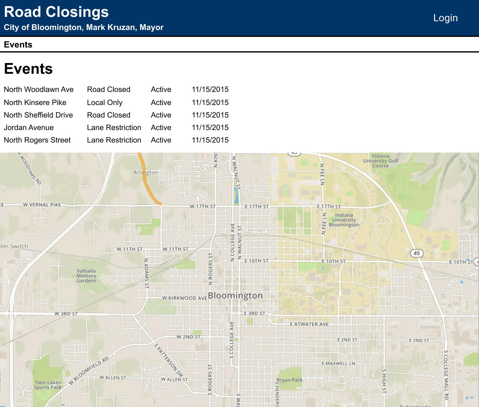
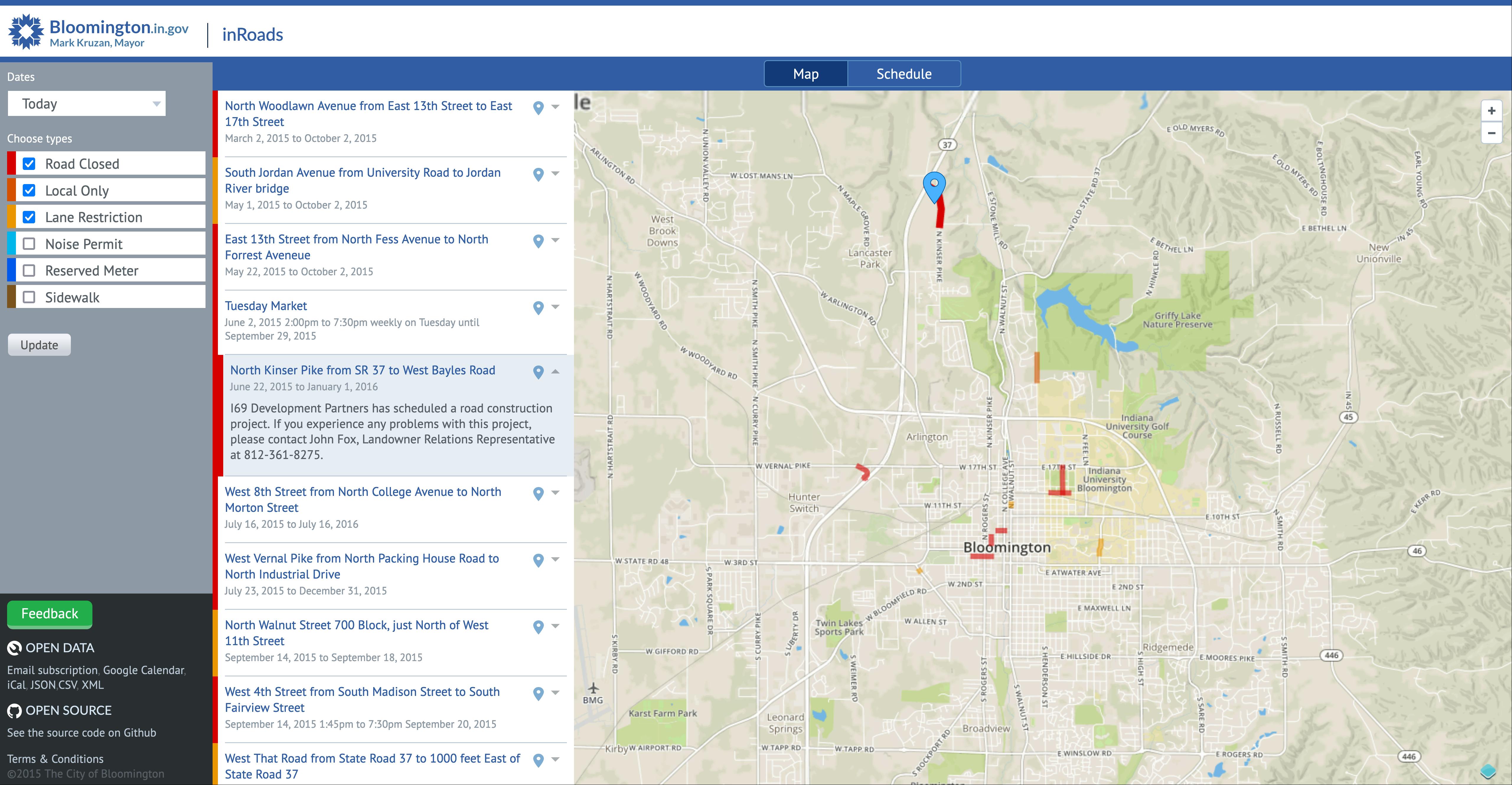
Before the redesign. The developer was tasked with proving we could layer our road closures on top of a map. After that, I smoothed out the rough edges.
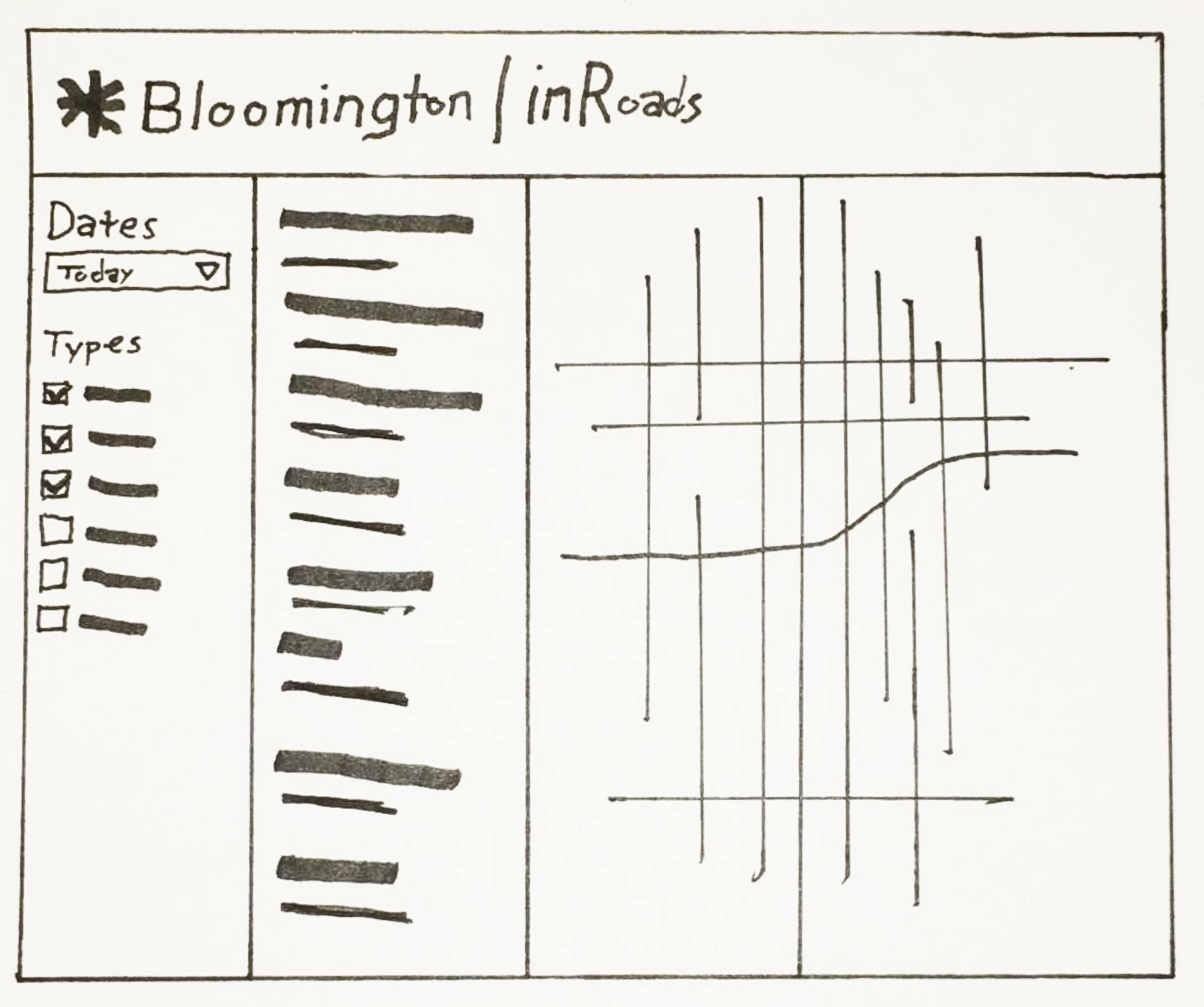
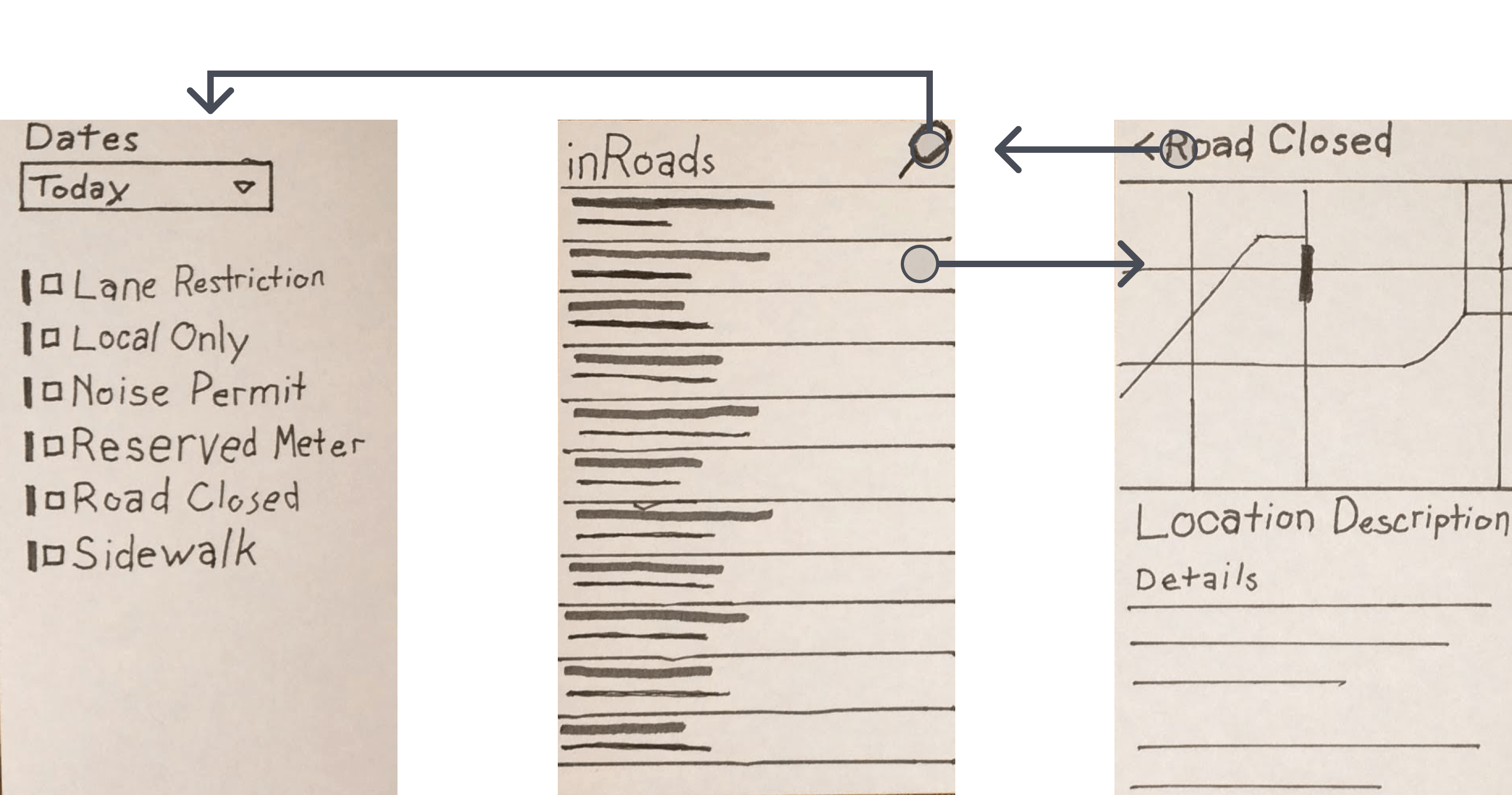
Rapid iterating in mixed fidelity
Early, rapid explorations. I used more fidelity to indicate where I wanted feedback, and less fidelity to defer feedback for later discussions. This helped me get feedback on questions like how to visually structure the filtering inputs, and revealed a new requirement that we had managed to miss: A need for a text-only mode.
Pulling the best pieces together on a whiteboard
Group whiteboarding. The team and I discussed the rapid iteration wireframes and did some whiteboarding to come to consensus on what worked, what was missing, and how to structure the screen.
Designing high-fidelity in code
Instead of high fidelity mockups, I implemented the high fidelity design directly in UI code, similar to how UX Engineers often implement designs as React prototypes.
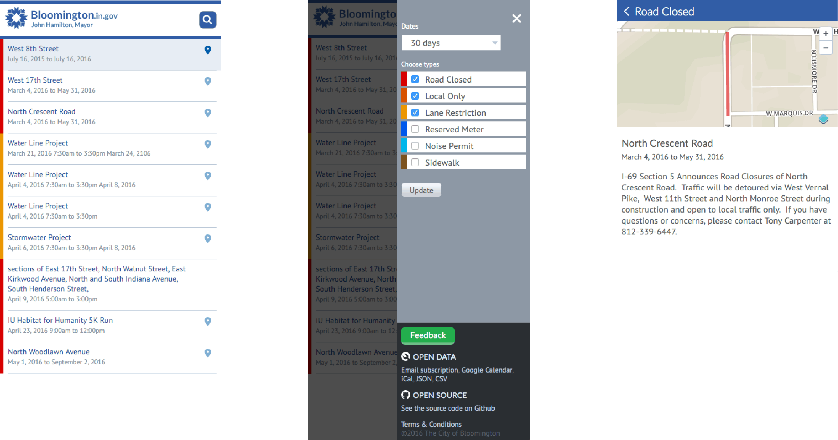
The public beta. We went from the whiteboard straight to development, where I used HTML and CSS to create the high fidelity look and feel.
UI Remix, 2023
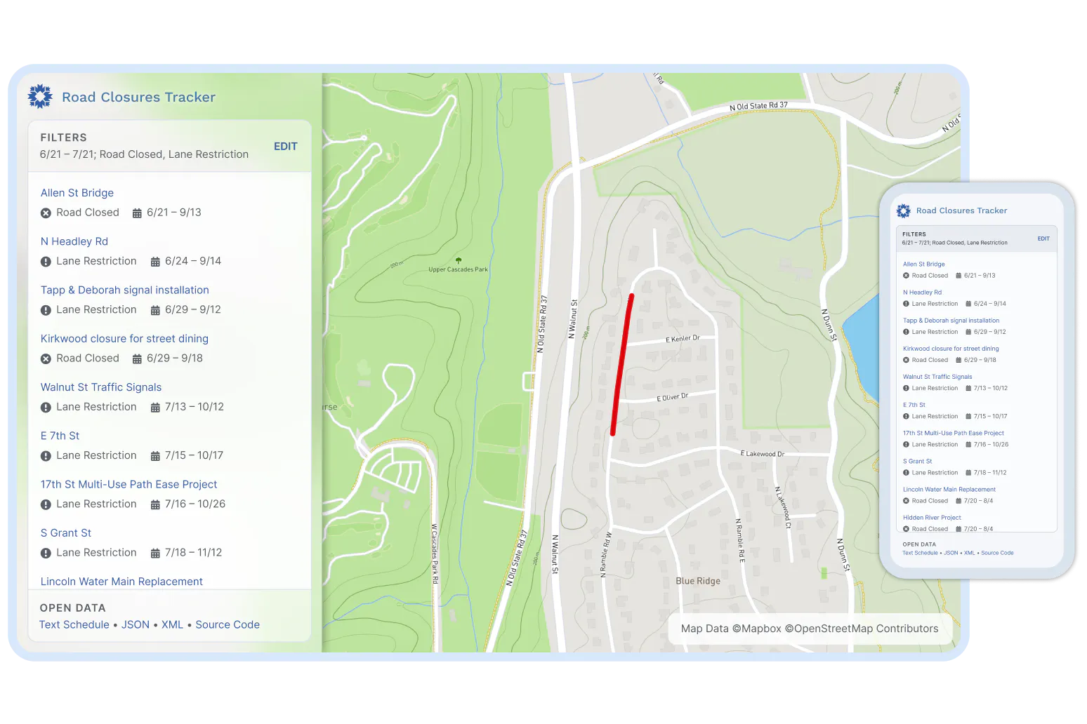
I’ve learned a lot about how to make a design look cleaner, and make the product look more dependable since I did this project. In 2023, I remixed this project in Figma, to show what it might look like if I designed this today.

Remixed index for drivers. This remix shows how my knowledge of UI craft has evolved. It also addresses some shortcomings of the original design, like only showing the filtering panel when it’s needed, or improving accessibility by using more than colors alone to convey the road closure type.
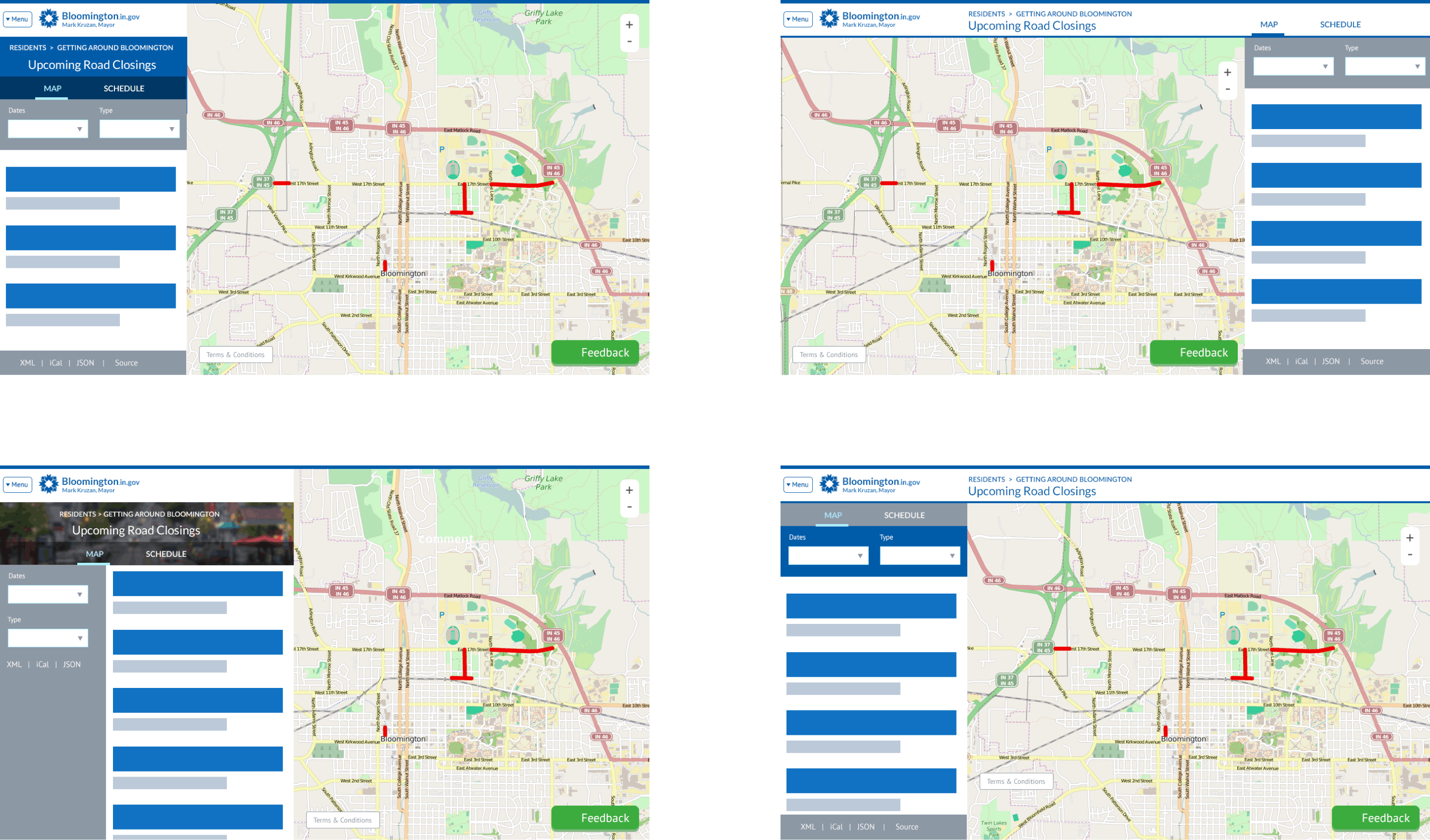
Can we make this responsive?
Public feedback revealed demand for this web app to work on phones. I quickly did some sketches on note cards to show how a responsive design could work.
How I pitched responsive design. I slid these cards on the table to illustrate panels sliding in and out of view, and explained how each card made use of UI elements already in the app.
The responsive UI. My design saved an estimated 77% of development time by repurposing UI code we had already shipped.
Bringing it all together with the admin UI
The developer and I sketched out form fields based on what we observed when we shadowed the mailing list maintainer.
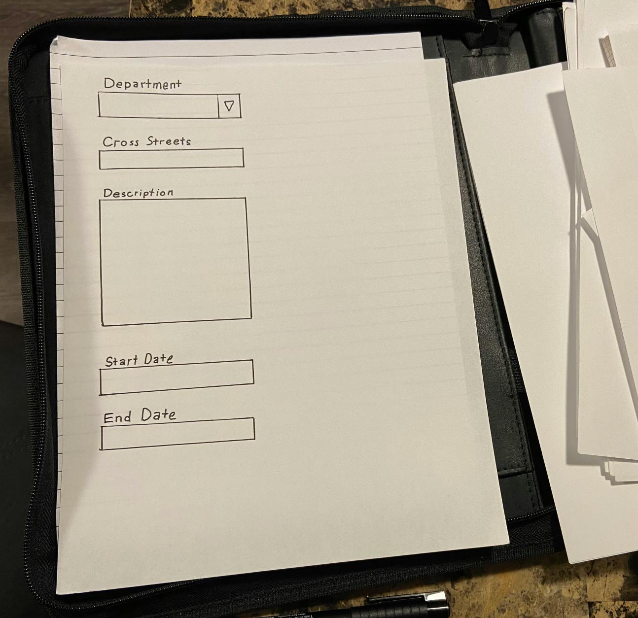
Sketches. The developer and I used pen and paper to visualize our ideas as we worked through the details of what we needed to capture.
The Admin UI. Our stakeholder wanted this done as quickly as possible, so I repurposed UI patterns we had already built.

Remixed index for admins. Using mostly the same components as the front end index, this also adds a search bar, to make it faster for admins to find a closure they need to edit.

Remixed closure add/edit screen. Here I’m showing how I would lay out the form differently, making better use of space, color, and adding icons for the drawing tools.
“Ugh. I clicked wrong again.”
When the developer and I tested our work, we both said out loud that we made a mistake, and we just needed to learn the UI correctly. But when it happened several times, I realized we weren’t the problem—the problem was the UI, and we can fix it.
We kept accidentally drawing on the map, when we intended to drag, because the UI started with drawing mode enabled by default. I solved the problem by having it start in dragging mode, letting us choose the drawing tool when we’re ready to draw.
The Admin UI enabled a game-changing productivity trick
Our UI enabled the admin to enter road closures in short bursts throughout the week. Compared to the old workflow, this changed their Friday schedule from being completely full, to completely open.
They told us, ”I keep joking with my coworkers, if you have a hard problem, just have the folks in IT make an app for you! It’s as simple as that!”
The app was a winner at the Code for America Technology Awards, for putting government data in the hands of the public.
Don’t let technology become a barrier to giving users what they expect
Let users choose what they want to do before they do it. In hindsight, we made that mistake with the drawing tool because we were excited about working with a new technology. This showed me how important it is to put the user’s needs ahead of our excitement.
Sharing elements between the desktop and mobile UI made it possible to deliver what users expected. Even though this app shows a lot of information, I was able to make it work on a mobile device by showing fewer parts of the UI at a time.
Questions and research that feel obvious to me now
If a stakeholder approached me about replacing a mailing list with a web app, the first question I would ask is, “How many subscribers are on this list?” to get a ballpark estimate of user engagement.
Run a user survey to check some basic assumptions. What devices users expect to see road closures information with? Would they use a dedicated app? Or do they expect this information in an app they already use?
Pursue impactful metrics. While I looked at analytics data to see how many people used the app, I think the real impact we wanted to have was to mitigate traffic congestion. With this being a city government, the designer I am today would like to have at least scheduled a meeting with a subject matter expert about what it may take to arrange a traffic study to measure the impact of this app on congestion. Potentially, the only real metric we could have collected would have been number complaints directed to the mayor. But I at least would want to have a conversation about what metrics to collect.