After shipping an already beautiful website, I helped the team push the boundaries of what’s possible with Elementor by using my coding skills as a cheat code on a stunning new product page; but I also worked with the team to scale contributions to the site by finding a “design systems lite” approach.
Wowing the client with a new product landing page
The creative team had some exciting ideas about how to visually tell the story about a modular room system, and I helped bring the ideas to life.

A good first impression for Modwall. The above-the-fold section of the Modwall product page.
We opted to use Lottie to show the layers of a room assembling, as text went past the animation.
We wanted more precise control than Elementor permitted, so I wrote custom CSS to give us the additional precision we wanted. I also adjusted the JavaScript parameters used by the Lottie player, to ensure the animation and the text content remained in sync with each other.

An animated explanation of a modular wall product. Our animator created an animation of all the different layers of the wall coming together. I designed and built a layout that would break the story down into small pieces of text, and show each piece of text next to the relevant moment in the animation.
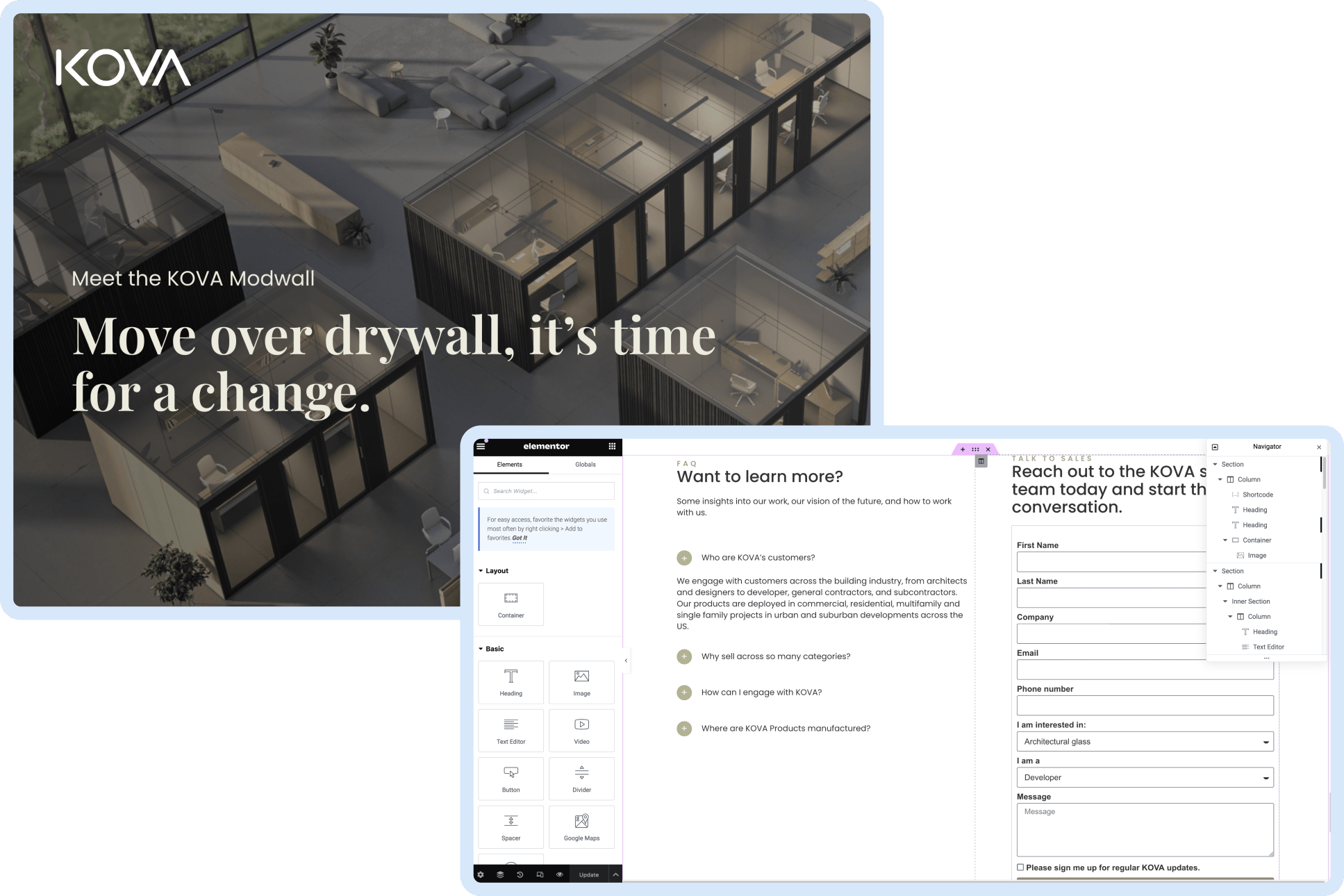
A lightweight, more flexible approach to a design system
As a small, scrappy team of generalists, a traditional design system isn’t a good fit for Goodthings. Instead, I treated this as an opportunity to “do it wrong,” because this site doesn’t need to scale the way enterprise software needs.

Design systems lite. I created reusable elements in the page designer, so that cross functional partners could create new pages that stay on brand.
Elevating search results from pretty but difficult, to an intentionally designed experience
Our search results page had not been a high priority when there were so many product pages to design and build. Eventually, this became a higher priority.

Before shot. This design was slow to skim, and it frequently felt like it was difficult to find desired results.
I created wireframes to propose a few suggestions of what a search results layout could look like, following the F-shape pattern our eyes naturally follow when they scan text. Elementor’s page builder can be slow to work with, so making wireframes in Figma saved time, and also served as a way for me to visually communicate backend feasibility with the team.

Iterating and shipping. Reviewing wireframes showed us that seeing a date on search results isn’t helpful on a site that primarily lists products. We also opted to move the page category from a chip hovering over the image, to an eyebrow above the page title.
I also improved the user experience by configuring search results to give much stronger weight to page titles than to page text.
In early testing, we found that if we searched for the name of a product, the press release announcing that product was listed first in search results, not the page of the product itself. On a website that exists primarily to help sell the product, it was mission critical to ensure the product page is listed first, so I carefully configured the search ranking behavior to better align with the site’s purpose.
Clarifying the site’s structure in the footer, while optimizing for space
When the site originally shipped, it only had a few page links in the bottom. But as we added more pages, the height kept growing. As the site iterated, one of the pages was expanded to three pages in a section, but the name of the original page remained as a link to nowhere.

Before and after. My redesign both makes the site’s structure easier to understand, and makes more effective use of space, while continuing to utilize the site’s layout grid for horizontal rhythm.