My team built more apps than we could maintain
The two back end developers had each shipped over a dozen internal tools for a wide range of use cases, including a database of public board members, problem reports, road project management, and City Hall’s internal staff directory.
As our backlog of projects grew bigger and bigger, we needed to ship more apps in less time.
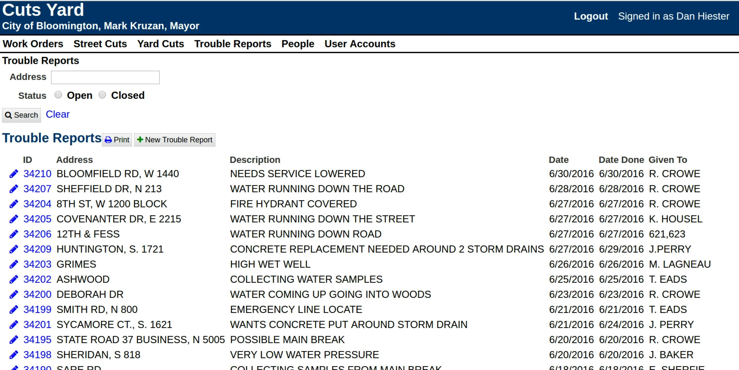
Before the refresh. What an internal tool typically looked like before I joined the team.
Starting with a fresh coat of paint
I focused on a visual refresh of elements that were common to the apps that were already built.
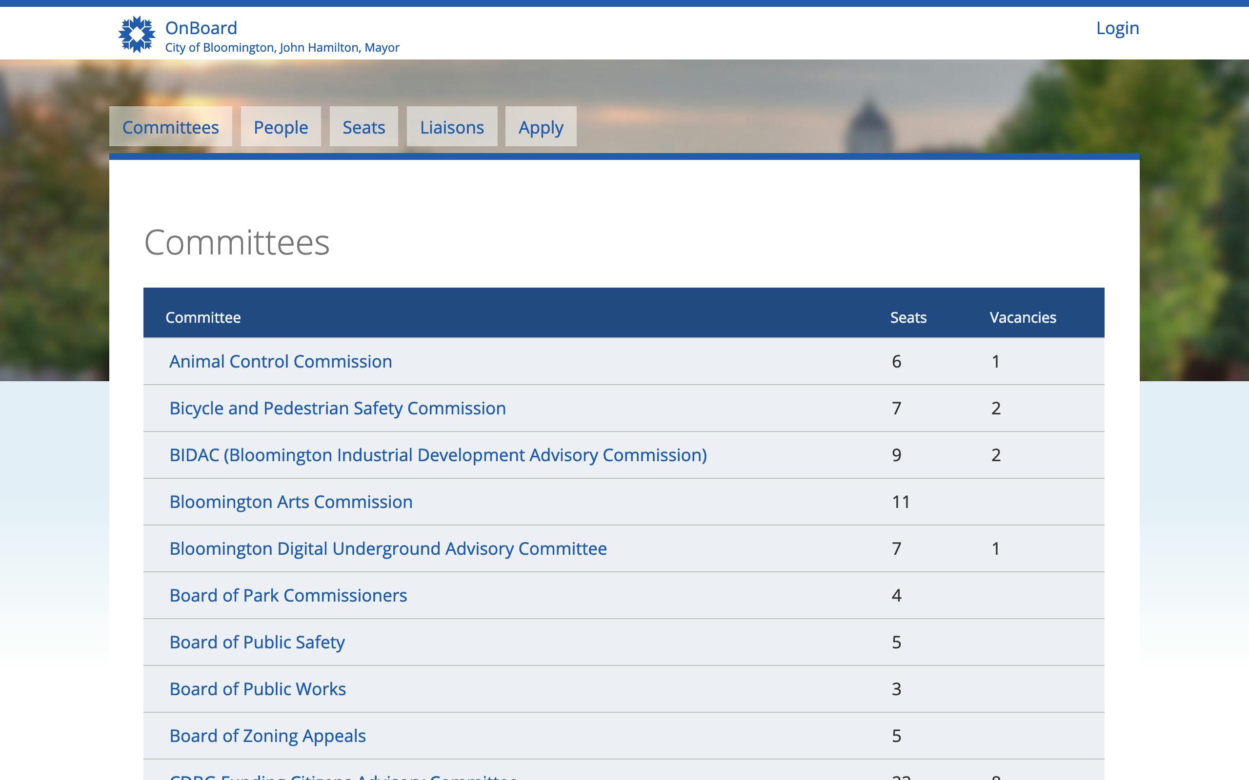
After the refresh. Many of the apps I saw were not nearly as data-dense as the enterprise training management app I had worked on at my previous job, so it made sense to give these apps some visual breathing room. The background image appealed to civic pride by featuring a beloved local landmark.
Going responsive, one small opportunity at a time.
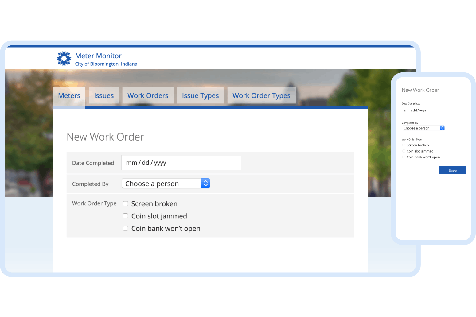
Parking enforcement officers needed to track broken meters and the work orders to repair them—right from their City-issued phones. I seized on an opportunity to help the team do something it had never done.
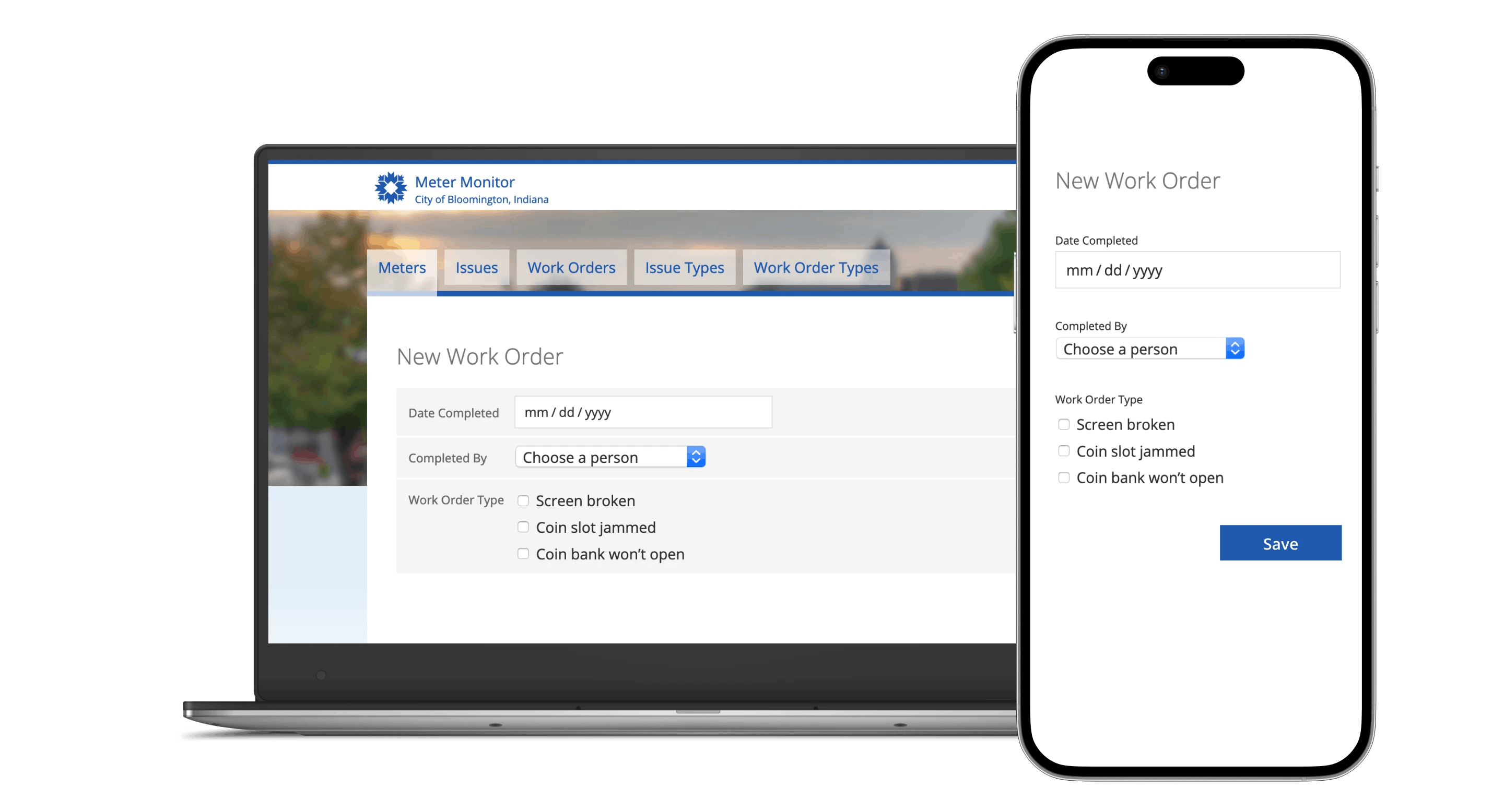
One small step for the library, one giant leap for the team. By December 2014, the team hadn’t worked with responsive design. By adding responsive patterns to the library, I enabled the developers to support both phones and desktops from the same codebase, without increasing their workload or forcing them onto a painful learning curve.
Making the pattern library themable
My team proudly makes its open source software available for other cities to use, so our UI needs to be adaptable to their branding.
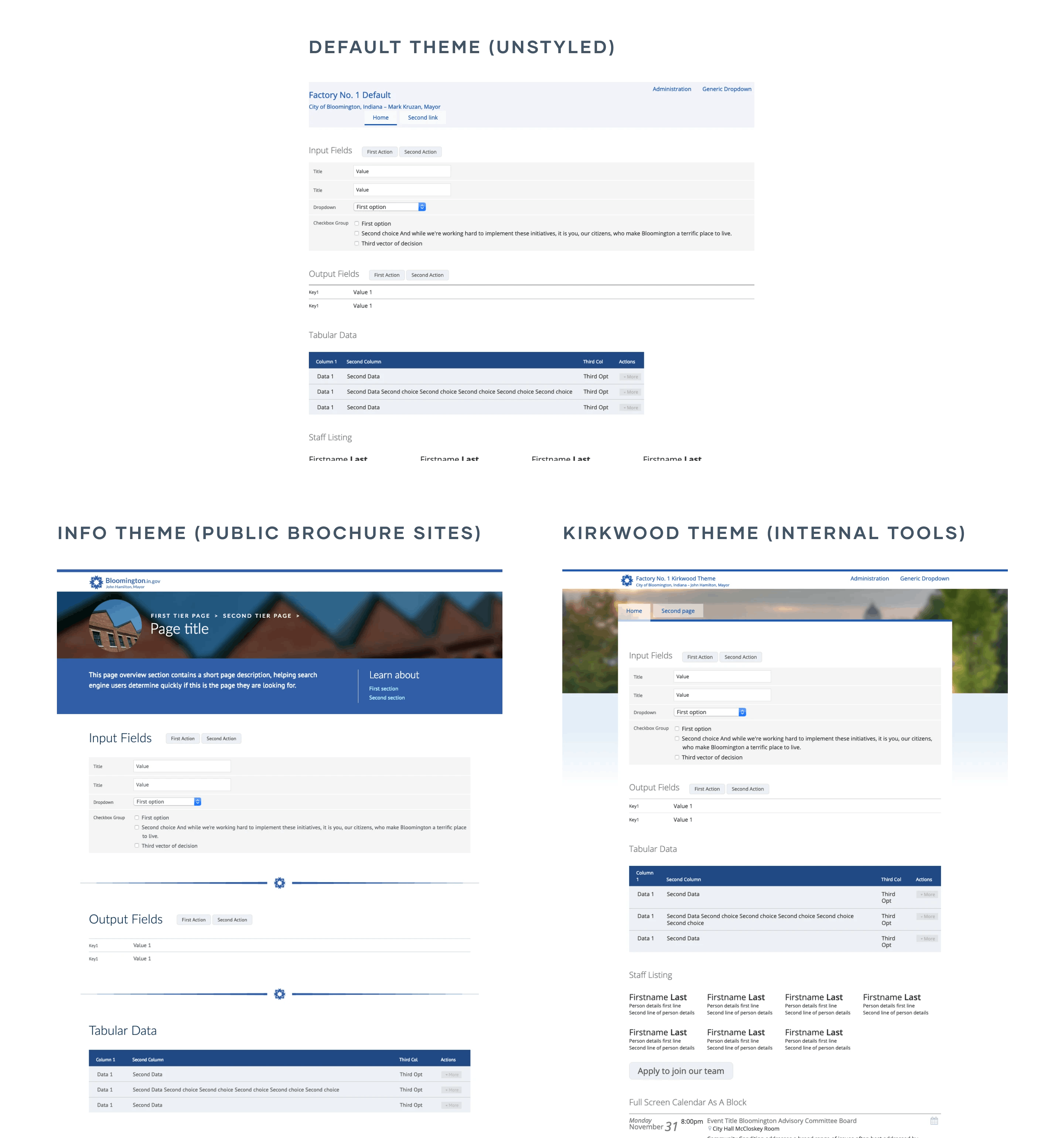
Dogfooding our theme system. We started an un-branded baseline theme (top), and built two themes on top of the baseline (left, right), to demonstrate what was possible. The theme system was flexible enough for other cities to completely replace our branding and information architecture with theirs—and add their own branded components to their theme.
Generating code samples for different tech stacks.
My team consisted of two specialists: one PHP developer, and one Java developer. The design documentation and code samples needed to be equally valuable to both of them.
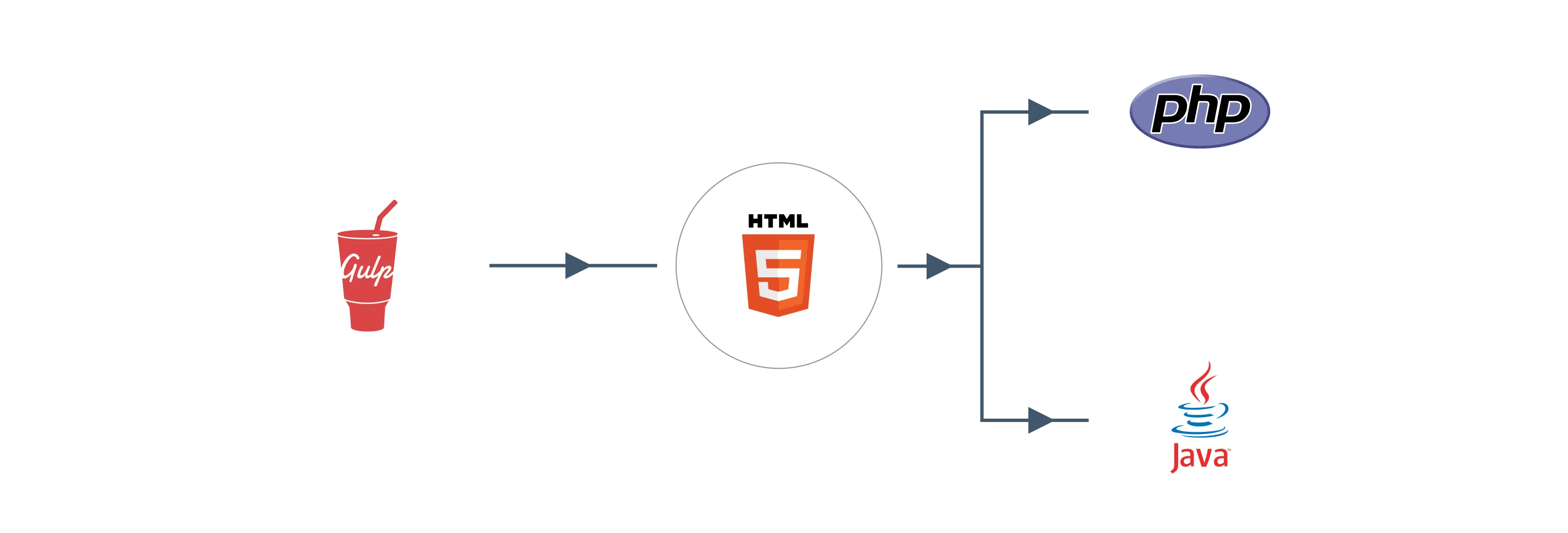
I used Gulp to build stylesheets with node-sass, and templated HTML with Swig (before Swig was orphaned). I handed off HTML, CSS, and JS to the two backend developers, who adapted the code to work with PHP and Java.
Planning for growth with semantic versioning
I established a workflow with the following steps:
- Build new apps using the bleeding edge version of the pattern library.
- When a new app is ready to start user testing, ship a new release of the pattern library, and update the app to use the new release instead of the bleeding edge version.
- Use semantic versioning to communicate expectations about backward compatibility.
Results
Shortly after we unveiled the new design in the Staff Directory app, one high-ranking person from another department commented: “I usually hate everything you guys do, but I like this. This is good!”
Developers were able to implement UI with little to no input.
The theme for the City website helped me win buy-in for more challenging design projects. Once I proved that a UI pattern designed for one department can be used for any other department, I was able to design a landing page for the Parks & Recreation Department.
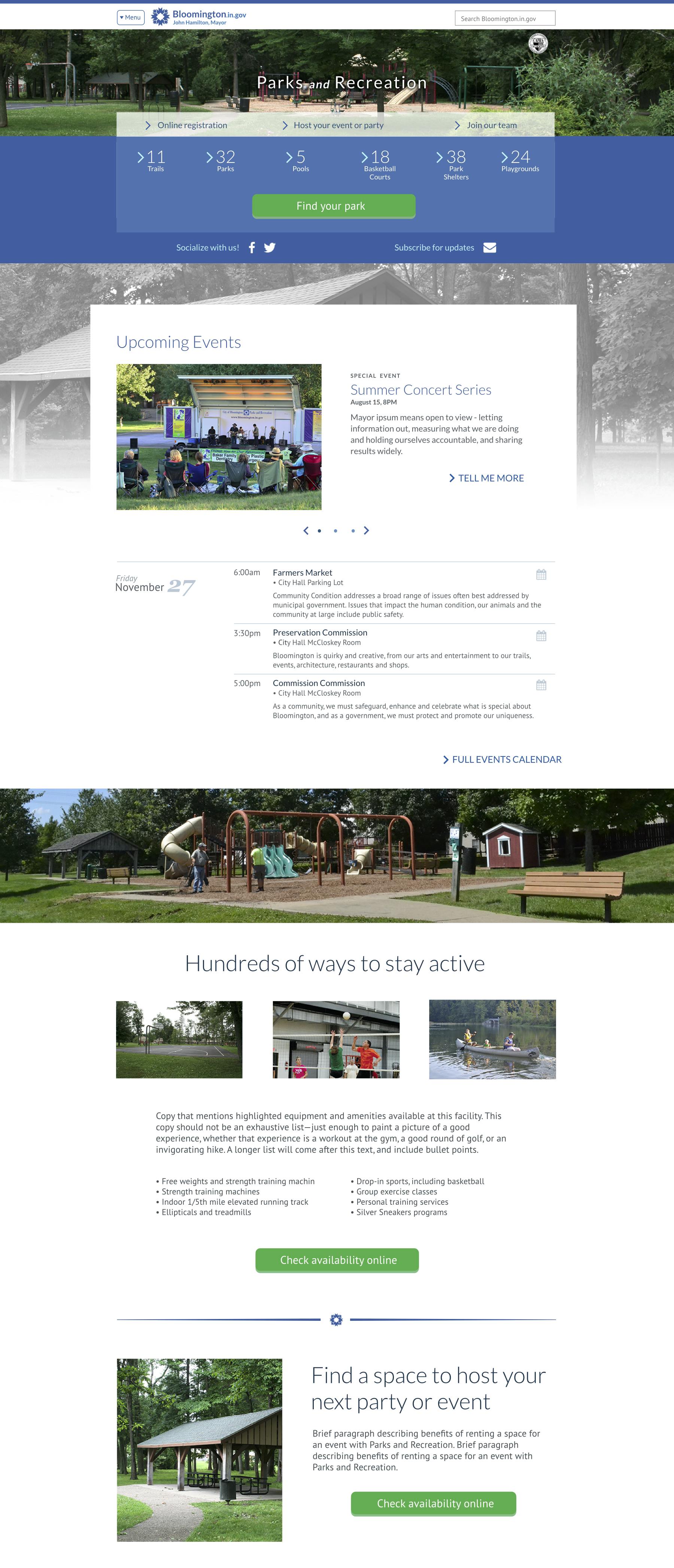
Parks and Recreation Department landing page. I was able to push back against hesitancy to do custom design for one department by arguing that if we add a pattern to Factory Number One, this design work won’t be “playing favorites,” it will be a value-add for the whole organization.
What I learned
When getting buy-in for a design system or pattern library, lean in to the productivity benefits with stakeholders.
At the time, this was a big change for the team. There was initially some resistance from individual developers to working with a UI library like this. However, once I convinced the engineering manager of the productivity benefits, it was much easier for me to proceed.
What I would do differently
Demo pages are good. Demo pages and documentation is better. These days, I recommend that pattern libraries inform the team about:
- The maturity and API stability of each component.
- Version history.
- Guidelines about when—or when not—to use each component.
Use Web Components to make the same patterns available to different tech stacks. Instead of using Gulp and static HTML to make the same design patterns available for different development platforms, I would recommend a front-end componentization strategy. That might be using something like React or Vue, or it could be using Web Components—potentially leveraging a library like Lit or a compiler like Stencil. It depends on the team.
