Redesigning a city government website was more than a visual refresh. It was a challenge to:
- Remove barriers to services people need.
- Encourage public participation in governance.
- Take part in shaping how local government adapts to an increasingly digital world.
The old site confused everyone
The existing site had inconsistent navigation, and was prohibitively difficult to maintain.
It had sidebars that weren’t related to page content. It was built on an in-house CMS that was no longer a priority for development, leaving website contributors stuck with quirks that required training from the webmaster, or a computer-savvy intern.
Placing pages into the navigation tree was a confusing process, and some contributors manually created their own navigation inside the content sections of pages.
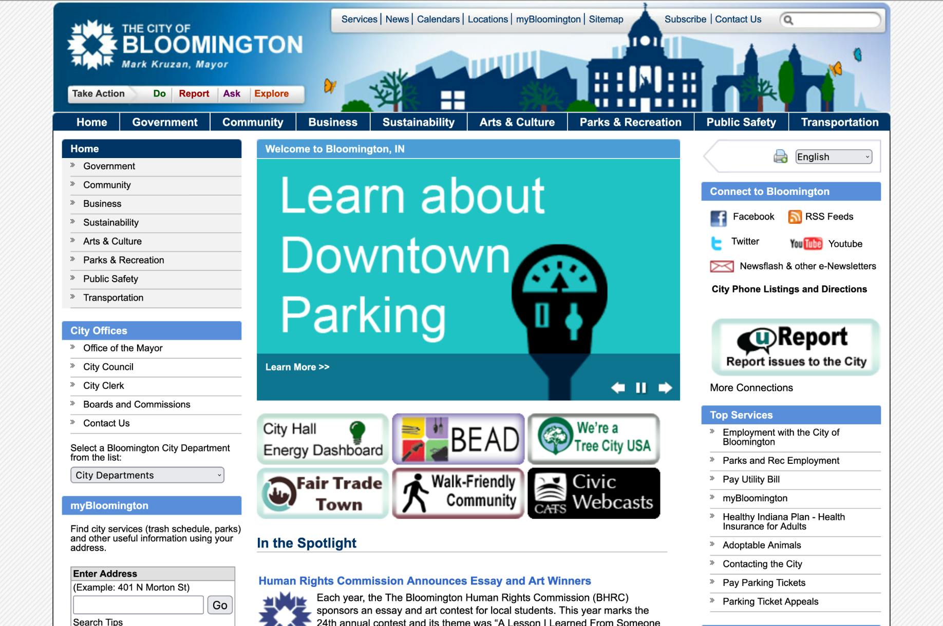
The Before Shot: The 2006 version of the City of Bloomington website.
Learning what constituents need from a local government website
To understand what makes a government website solve a real problem, I conducted secondary research, internal interviews, comparative analysis, and an analytics review.
Three key insights:
- Organizing pages by department was convenient internally, but created confusing barriers to access for the public.
- Digital services are a hard requirement for making services accessible to many constituents, especially younger workers.
- People often panic when they discover they need a government service.
Setting the direction for design
With so many use cases to design, I wrote design principles that helped me focus on making making the City Government more approachable and accessible to the public.
- The visual tone should feel official, but welcoming.
- Pages should start with a warm welcome, and continue with a formal follow-through.
- The homepage and navigation should help constituents find their way when search engines let them down.
Understanding why we add each page
The previous site had many pages that seemed to be there “just because.” To avoid repeating this, I proposed a worksheet for each new page, with three questions:
- Who are we helping?
- With what are we helping them?
- How do we know they are getting it done?
Designing for constituents to take action
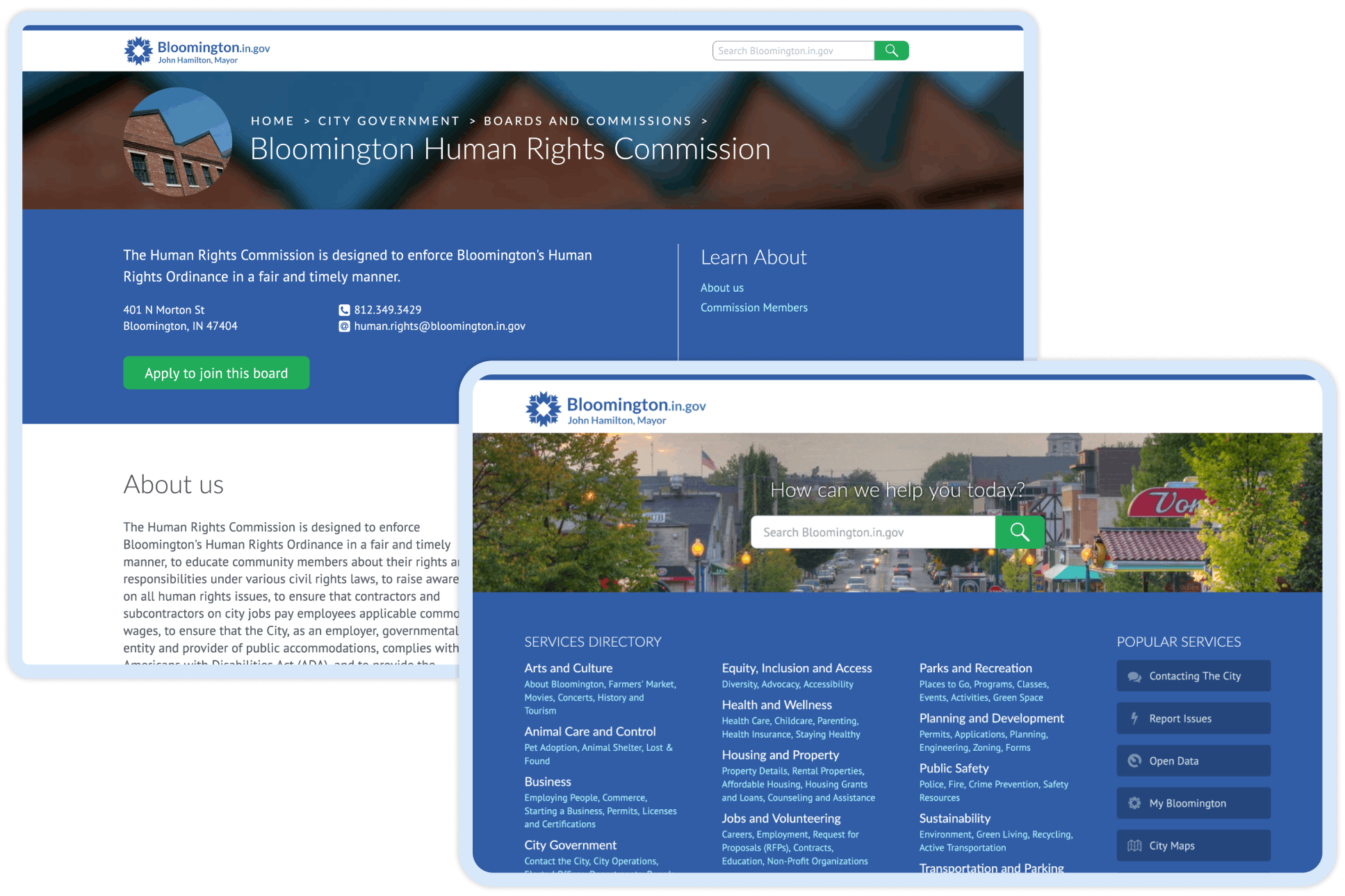
We replaced our in-house CMS with Drupal. Its support for custom content types made it easy to design layouts focused on helping constituents take action.
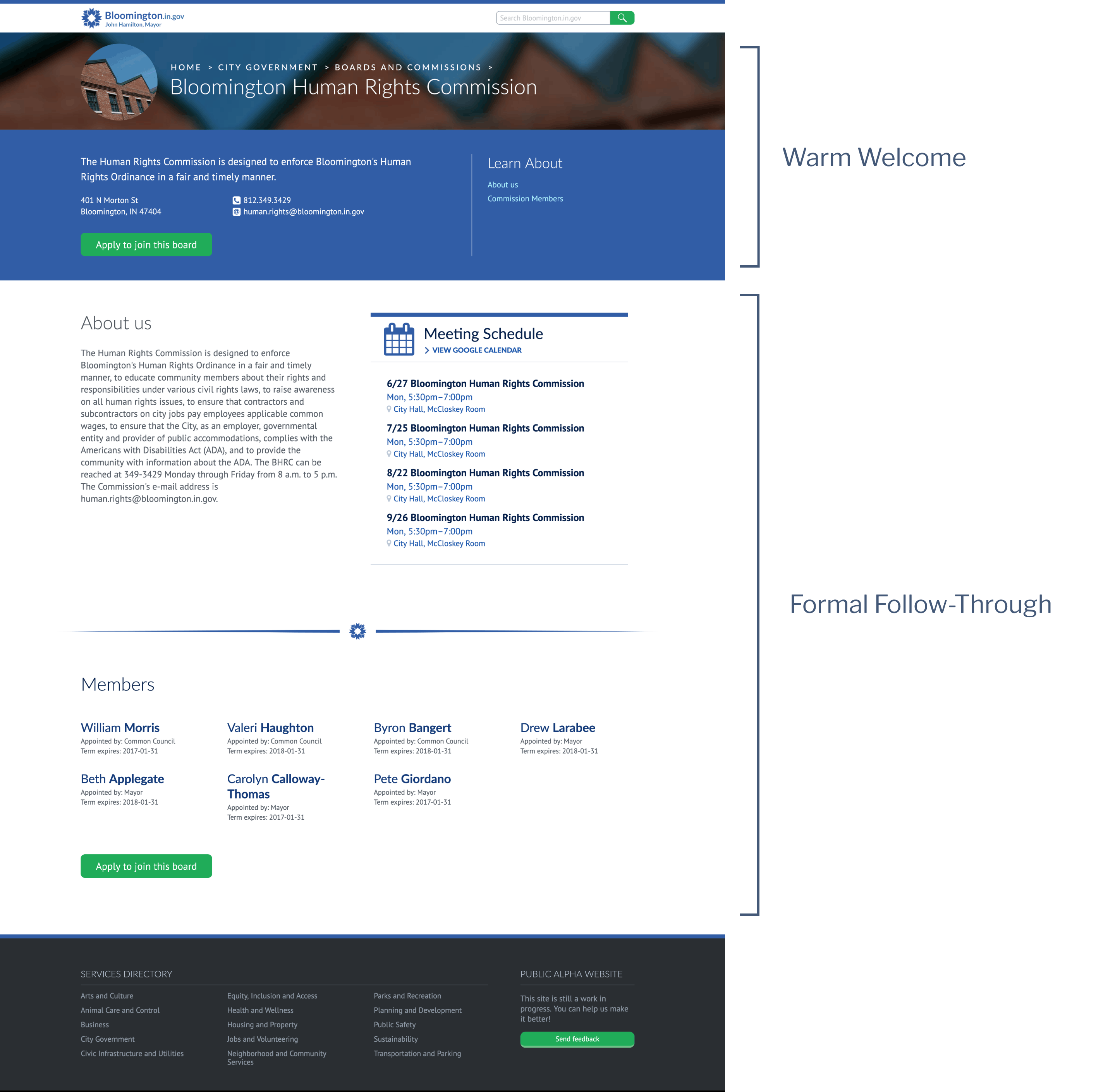
The warm welcome and a formal follow-through. The top of the page gives context to visitors just landing here from a search engine. As they scroll down, they can see how to take action.
Creating a sense of place
I designed the page header to support custom headers, to help make individual pages memorable, so constituents can recognize a page they’ve seen before.
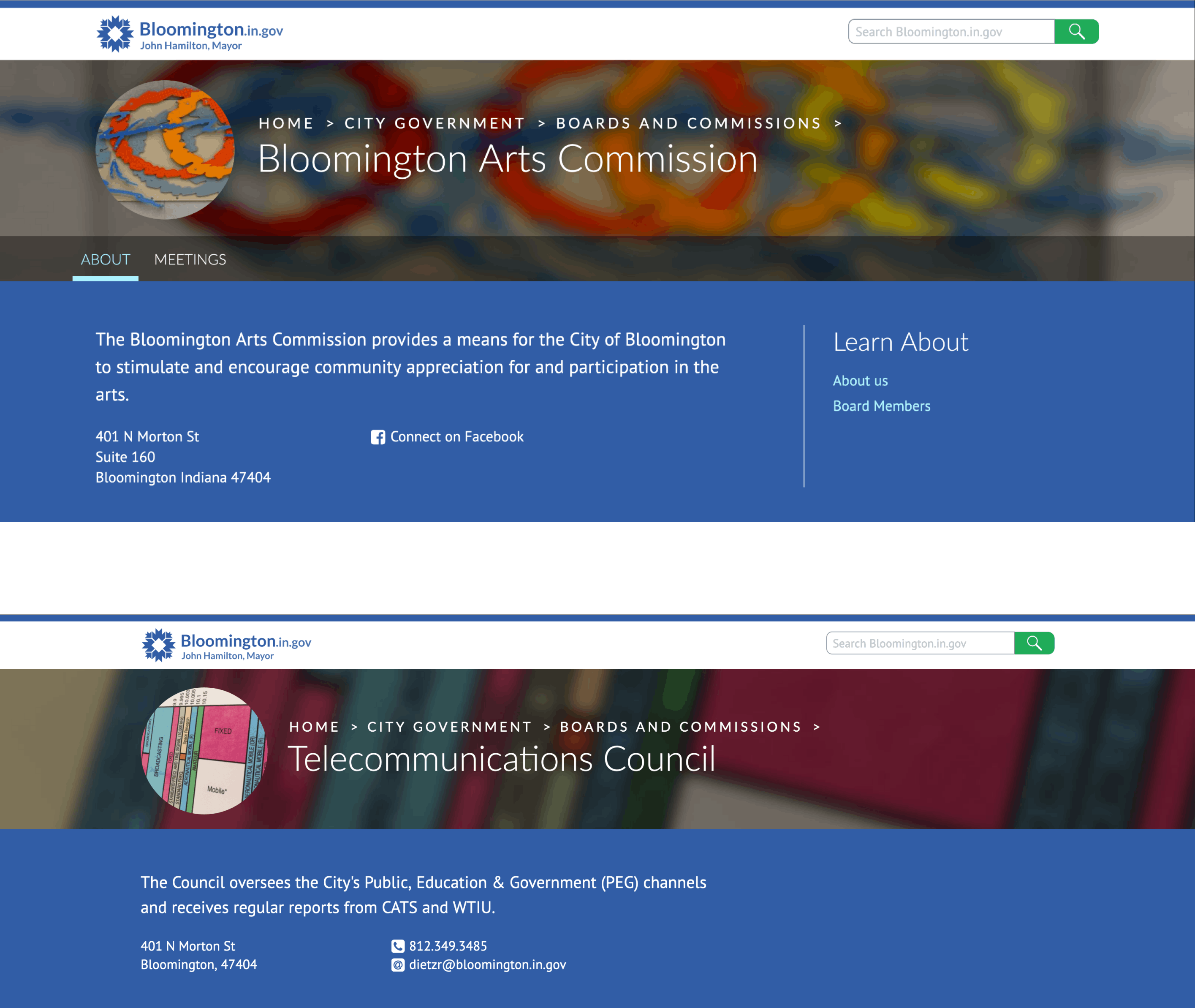
Examples of custom headers. This enabled contributors to create pages that look unique, while also keeping a unified look and feel across the site.
Helping visitors find their way when search engines let them down
Analytics from the old site showed that most visitors navigate directly to internal pages from a search engine. I guessed there were two potential reasons for visitors to start at the homepage:
- They weren’t satisfied with results from an external search engine, so they wanted to try a search engine that was internal to our site.
- They didn’t know which words to search for, and needed help finding the right words.
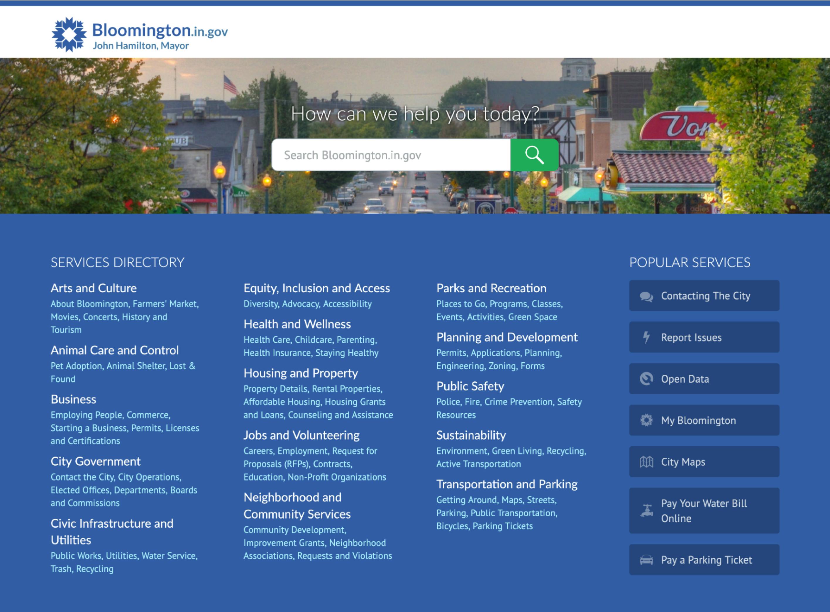
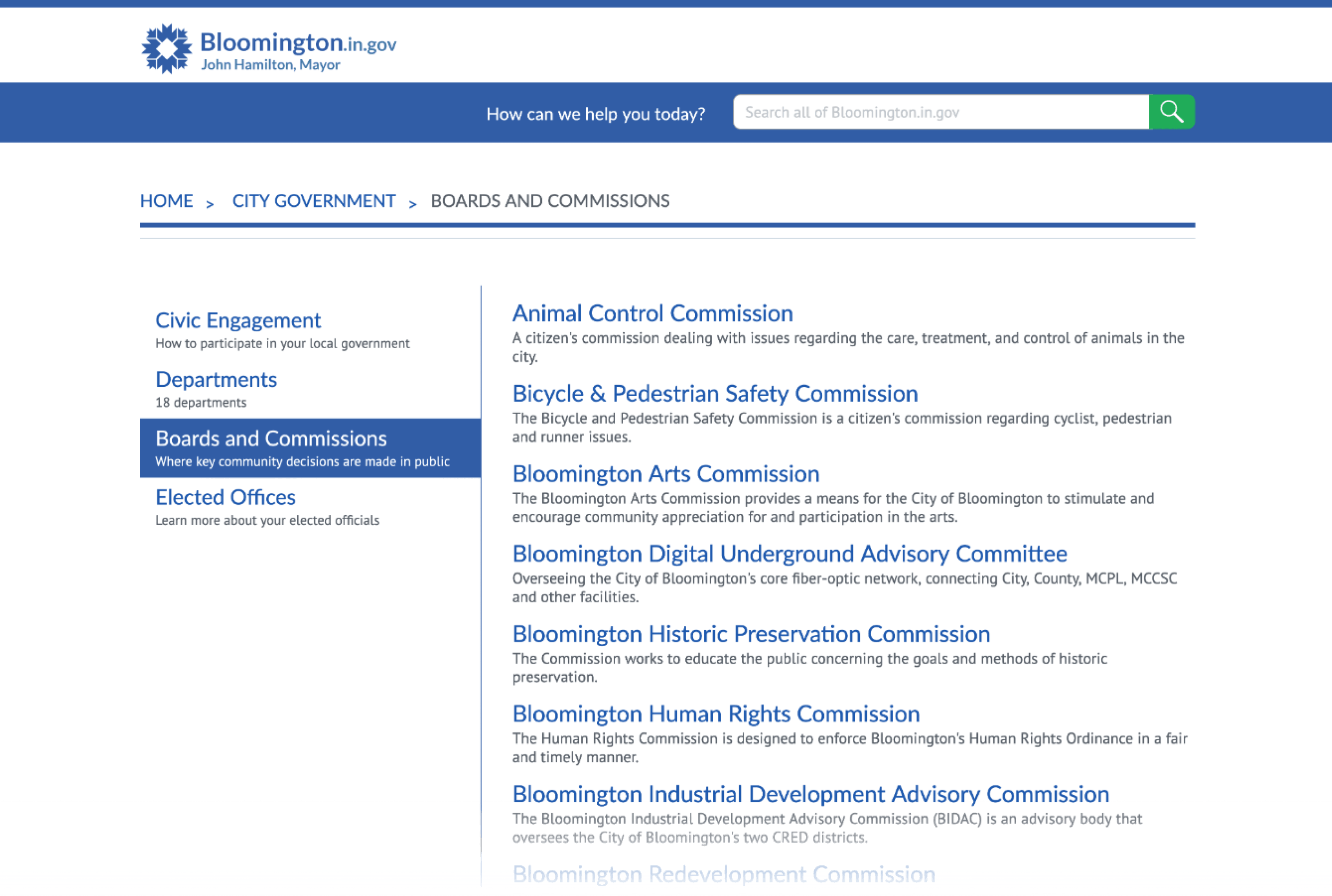
Lost? Here’s a directory. I redesigned the homepage to emphasize a directory of services, sorted by categories that make sense to people who don’t know City Hall’s org chart.
Providing context for visitors who browse. Because most visitors arrive at inside pages directly from search engines, I assumed most visitors to this layout don’t know the right words to search for, and need context to explain where they’re navigating.
Two public alpha releases shipped, and a change in direction
In the second alpha release, we launched a homepage design that made government services accessible without needing to be a municipal civics expert.
The team was pressured by an unrealistic timeline. My research showed other teams on similar projects took years to finish their site. With an impending change in leadership, the team felt pressured to finish in a few months. The plan pivoted from small, iterative releases, to one big, final release.
I moved out of state, but my content design ideas impacted later redesigns. The successor in my role restarted the design process. Even though the new design went in a different direction, it adopted several concepts from my design, like:
- Organizing services by categories, not departments.
- The page overview, with contact information of the department that maintains the page.
- A focus on constituents taking action, with pages for public boards prominently featuring a calendar, so constituents know when and where to participate.
How this project challenged me to grow
A designer’s job is to navigate to the best compromise. This project had so many stakeholders, I accepted that it’s impossible for one design to please everyone—and that let me focus on looking for the most informed, optimistic compromise, instead.
Problems with contributors can be an opportunity to improve their tools. I often asked questions like: “If someone does something that looks ‘stupid,’ is it possible they found the best way to solve a valid problem with the tools we’ve given them?” Instead of gatekeeping, I built partnerships across teams.
Tools and strategies that may have led to a different result
There really are too many things I would do differently to discuss briefly. Here are some of the highlights:
Mitigate risk with a more iterative process. Even though we had services with validated demand, the implementation of putting them online was new territory for us, which put us at risk for making mistakes. To help mitigate this risk, I proposed we select a small subset of services, design some templates, publish a few pages, test them, and iterate based on what we found. In this case, we didn’t have the budget to iterate, but I still believe that iterating is an important strategy for mitigating risk and encouraging growth.
Seek out allies to support uncomfortable ideas. Some of the processes I pitched for this project were outside the team’s comfort zone at that time. Since then, I’ve learned to find like-minded people who voice support for an idea in review meetings. It’s common for one person’s ideas to be dismissed, but when two voices speak up, the room is more likely to listen.
Establish a review process with editorial experts. I created a design that needed concise writing to help confused users understand what page they’ve found. Unfortunately, the site’s contributors didn’t specialize in concise writing, so we struggled to make this design work in practice. In hindsight, I think when we noticed people struggling with writing short descriptions, it would have been better to partner with the Communications Director to establish an editorial review process.